
The vibrant hues of orange are a versatile home decorating color. It pairs well with many different colors, ranging from warm reds to cool blues.
It also looks good with harmony or analogous colors, which are those that lie next to each other on the color wheel, like green and yellow. It can even work with a neutral shade like gray.

The Psychology of Orange in Home Decor
Orange is a bold and vibrant color that can create visual interest and contrast in any room. Its stimulating effects can energize the mind, increase appetite, and encourage socialization, making it an ideal choice for kitchens, living rooms, and other spaces where people gather. It can be used to evoke feelings of excitement and adventure or to convey a sense of warmth and hospitality.

While orange can be striking on its own, it is also versatile and blends well with a wide variety of other shades. In fact, it is one of the most popular colors in home décor, with more than a quarter of all homeowners choosing to use this shade in their homes. When used sparingly, orange can bring a pop of color to neutral or monochrome rooms without overwhelming the space. Alternatively, it can add a vibrant splash of color to more traditional designs and help elevate accent pieces and furnishings.
When choosing the right shades to complement your orange home décor, it’s important to consider how much of a statement you want to make and whether you are using the color as an accent or a dominant hue. If you’re unsure how to incorporate orange into your home, it’s easy to start small by adding just a few accent items like throw pillows, lampshades, or window treatments to see how the color works in your space.
If you’re looking to create a more balanced and sophisticated look, orange pairs beautifully with many neutrals as well as natural greens and blues. Redder oranges, like coral and rust, pair nicely with aquas and other greener blues, creating a rich and unexpected palette. Orange also pairs well with gold tones, adding a subtle and elegant touch.

For a dramatic effect, orange can be paired with black, though this shade must be used sparingly and carefully. As a base color, it can overwhelm a space, so it is best reserved for dramatic accent pieces. However, when used with white, black can enhance the brightness of orange, creating a bright and lively room.
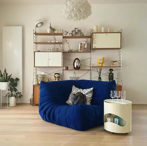
Orange and Blue
Orange and blue are a classic color combination that creates visual interest and contrast in your space. This versatile pairing embraces both warm and cool tones, making it a perfect complement for a wide range of aesthetics. Try incorporating both shades into your design for a balanced color palette that exudes confidence and energy.

Citrus shades, like lime, tangerine, and apricot, pair well with blues that are either bright or muted. Vibrant orange with turquoise or teal accents can create a fresh and tropical aesthetic, while earthy tones like coral and peach work well with muted blues for a serene and relaxing room. You can also go bold with vibrant orange paired with hot pink, fuschia, or magenta for a more energetic look.
Blue and orange can also be used to create a rich and opulent aesthetic in your home. Deep inky blues like navy and dark blue-gray can complement a variety of orange shades, especially those with darker undertones, for a sophisticated space. Blue-green tones, like teal and azure, work nicely with dark orange tones as well, providing a subtle but striking aesthetic.
Muted shades of blue, like slate and pewter, also work nicely with orange. These hues are muted enough to not overwhelm the vibrancy of orange, but still provide a neutral background for other color elements in your space. You can also use greys with a range of orange shades, from lighter tan to sherbet and even burnt orange tones for a more neutral but vibrant look.
Cool white shades, such as vanilla and cream, pair well with almost all orange colors, and they provide a crisp and clean aesthetic to your space. For a light and airy feel, combine cream with tangerine and sherbet oranges to create an energetic yet refreshing space.

Dark browns and earthy greens complement burnt orange tones, evoking an organic and natural atmosphere in your home. You can also add a pop of color to your room with a patterned accent wall or orange furniture, such as the burnt orange sofa from silkenfavours in this living room design.

Orange and Green
Orange is a vibrant hue that adds a playful dimension to your design aesthetic. Its range of shades and nuances offer intriguing possibilities for your next design project. Whether you prefer the earthy richness of dark orange or the cheerful essence of yellow-orange, pairing it with blues and greens offers balanced contrast and visual harmony.

Color psychology reveals that orange is associated with feelings of happiness and energy. It is considered a happy and uplifting color that can boost confidence and stimulate creativity. As a result, it can inspire positive socialization in a space and make a great accent for sports teams or other groups that need to portray this sense of energy. Bright oranges, such as tangerine and cadmium, are bolder and more vivid, capturing attention and evoking enthusiasm. These brighter hues are best used as accents for a balanced and energetic palette, as they can overwhelm a space if used in large amounts.
Muted greens such as teal, forest, and olive are harmonious with various shades of orange, ranging from pale peachy to rusty. This natural and earthy combination is a great choice for outdoor or nature-themed designs, offering a balance of warm and cool tones.
Shades of pink, from soft and pastel to bright and vibrant, are also great complements for orange. This is because they share similar properties: both are vibrant, lively, and energetic colors with warm undertones. The difference is that pink has a more subtle and feminine appeal while orange is more bold and masculine.
If you want a more harmonious and balanced color palette, opt for browns or other earthy tones that are naturally compatible with orange. Browns and other neutrals work well with all shades of orange, ranging from the softer peachy tones that are commonly used in interiors to brighter tangerine or cadmium orange. This natural look is a good choice for a classic or traditional style, and can also complement the earthy tones of forest green or moss green. Alternatively, try pairing a soft or muted orange with a deep purple shade for an upscale and sophisticated aesthetic.
Orange and Gray
As a versatile neutral shade, gray can complement orange and help to create balance and contrast in a color scheme. A palette of grey and orange can look elegant, sophisticated, and classic. It can also add a modern, contemporary feel to a room.

When used thoughtfully, the warm hues of orange can elevate and enhance the beauty of any gray shade. The trick is to find the right mix of shades and tints to ensure that the orange stands out rather than gets lost in a sea of neutrality.
For example, a dark brown or muted tan pairs well with any shade of orange for a warm and earthy palette that exudes warmth. This pairing can be complemented with accents in green or blue for added visual interest. Or, you can lift the intensity of burnt orange by adding a touch of brighter yellow or gold.

Orange can also be mixed with cooler shades of gray to create a rich and elegant design. For example, the deep navy blue and orange used by artist Henri Matisse in his iconic painting “The Joy of Life” (also known as Le bonheur de vivre) offers a striking combination that conveys a sense of elegance and sophistication.
Bright orange also pairs well with cooler neutrals like slate gray. This combination can be particularly effective in kitchens, where the cool shade of gray can offer a welcome contrast to vibrant orange cabinetry or backsplashes.

Whether you’re looking to embrace the rich vibes of dark orange or the cheerful essence of yellow-orange, there are plenty of color options available to elevate and inspire your designs.